For years, there seemed to be one nearly universal rule when preparing a house for the market:
Paint it white.
White walls. White kitchens. White trim. White tile. Maybe a little gray thrown in for excitement.
And while a beautiful white room will probably never truly go out of style, I think we're beginning to see something much more interesting happening in interior design.
Color is coming back—but not necessarily the color you remember.
Instead, designers and homeowners are embracing what are increasingly being called “dirty neutrals.”
Don't let the name scare you.
There is nothing dirty about them.
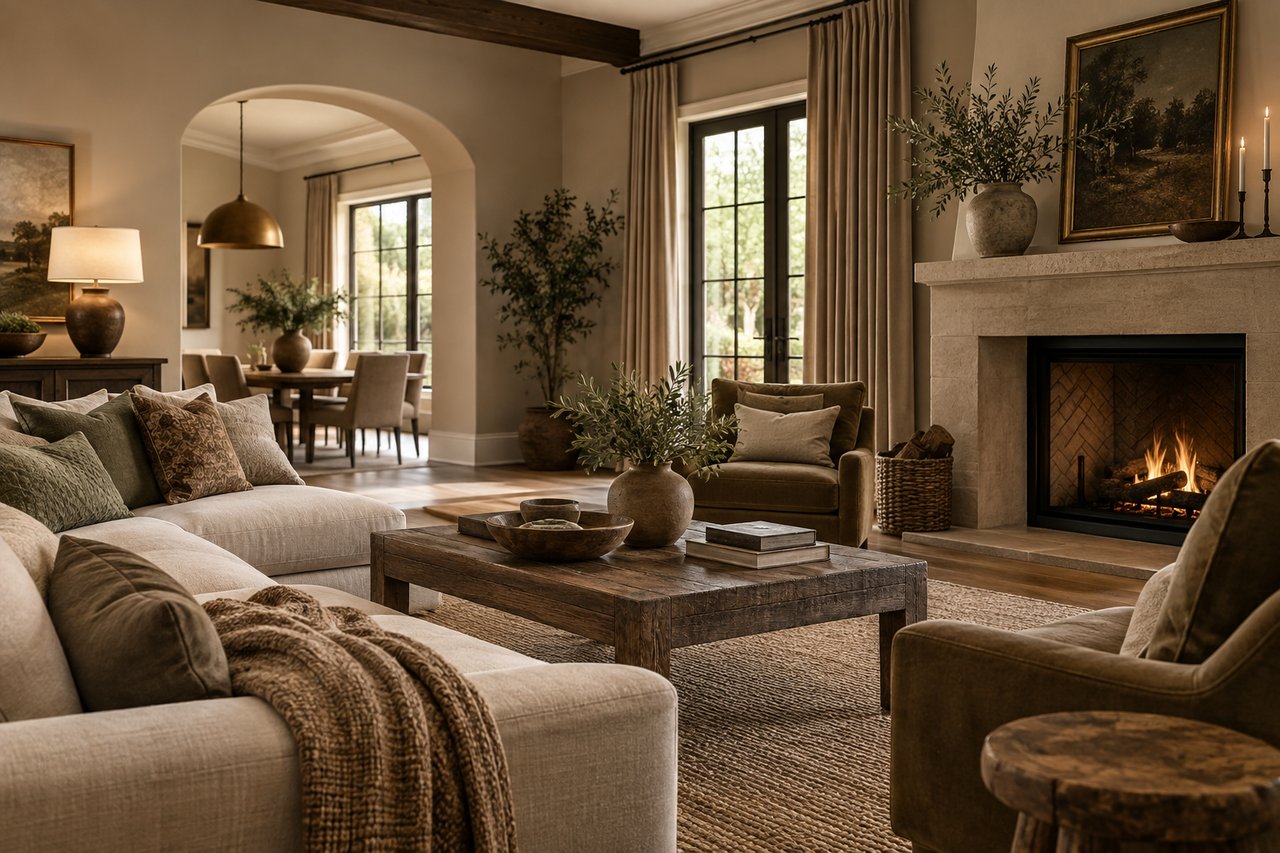
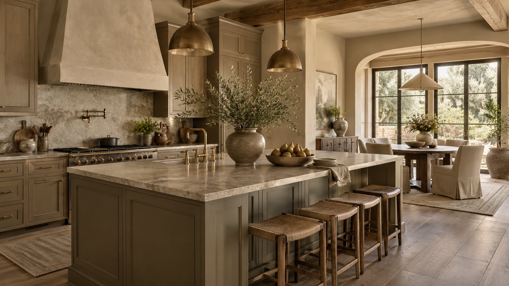
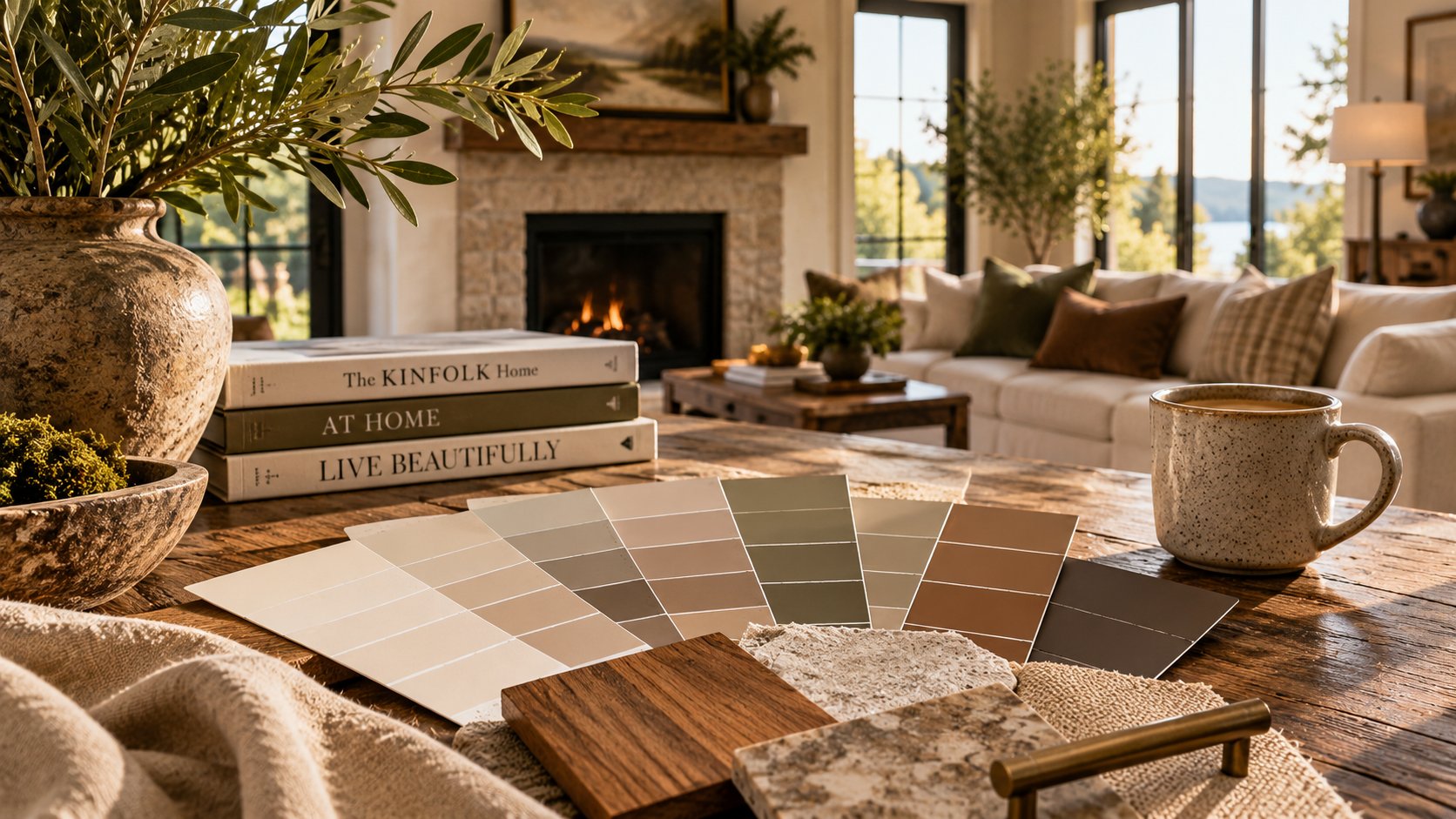
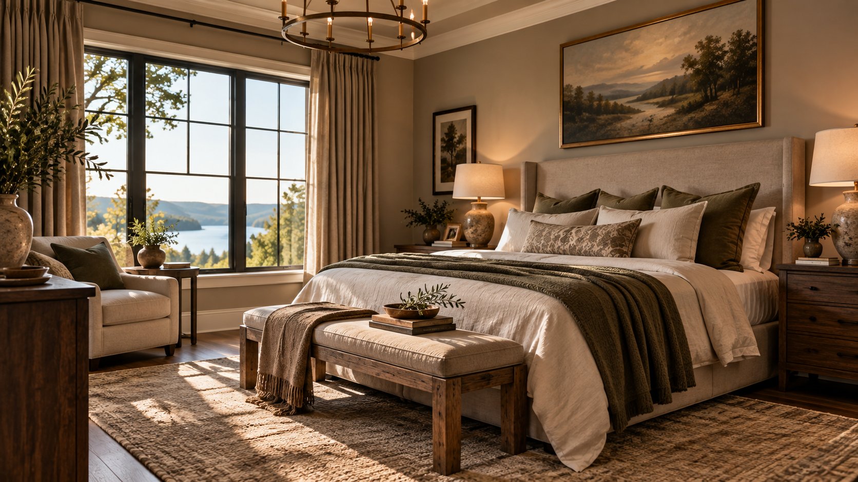
These are sophisticated, complicated colors that live somewhere between the traditional colors on a paint deck: mushroom, putty, warm taupe, muddy beige, tobacco, clay, cognac, olive-gray, stone and warm greige.
House Beautiful recently highlighted the movement away from stark whites and cool grays toward these warmer, earthier neutrals, noting that designers are using them to create rooms that feel warmer, richer and more relaxed.
As both a Realtor and someone who spent much of my professional life in design and photography, I find this shift fascinating.
Because it isn't just about paint.
It's about how we want our homes to feel.
We May Finally Be Leaving the Gray Era Behind
If you toured enough newly renovated homes over the last decade, you probably encountered the formula:
Gray walls.
Gray luxury vinyl plank flooring.
White cabinets.
White-and-gray granite or quartz.
Cool LED lighting.
More gray.
It photographed cleanly and appealed to a broad audience, which helped explain why builders, investors and homeowners embraced it.
Eventually, however, almost every design trend reaches saturation.
The problem isn't that gray suddenly became ugly. The problem is that certain combinations of cool gray and brilliant white can make a home feel sterile rather than inviting.
Today's interiors are moving in another direction.
We're seeing natural woods again. We're seeing warmer metals, textured fabrics, antique furniture, natural stone, handmade-looking tile and colors inspired by the landscape.
And dirty neutrals work beautifully with all of them.
So What Exactly Is a “Dirty Neutral”?
Imagine taking a conventional neutral and adding just enough another color to make it difficult to describe.
Instead of beige, perhaps it's beige with a little olive.
Instead of gray, it's gray softened with brown.
Instead of cream, it's cream with a muted clay undertone.
Instead of brown, it's a softened mushroom or tobacco.
That's what makes these colors interesting.
A straightforward beige tends to remain beige. A more complicated neutral can appear taupe in the morning, warmer in afternoon sunlight and considerably moodier after sunset.
That subtle variation gives a room depth.
House Beautiful describes the trend as occupying that hazy territory among beige, taupe and gray, with colors such as mushroom, cognac and olive becoming increasingly important in interiors. (House Beautiful)
And from a real estate perspective, there's another reason I like them:
They're colors without necessarily feeling like "COLOR."
That's important when you're thinking about resale.
Buyers Don't Just Look at Houses. They React to Them.
When I walk through a property with buyers, I'm constantly reminded that purchasing a home is simultaneously a financial and emotional decision.
Buyers might tell me they need:
- three bedrooms,
- two bathrooms,
- a certain school district,
- a two-car garage,
- and a particular price range.
Those are the measurable requirements.
But then we walk into a house and something happens.
They say:
"I love this."
Sometimes they can't even tell you why.
That reaction is incredibly important.
Beautifully designed rooms can communicate warmth, comfort and quality almost instantaneously. And warmer neutrals can help create that emotional response without overwhelming buyers with a highly personal decorating choice.
That's where this trend becomes particularly interesting for homeowners considering selling.
Warm Doesn't Have to Mean Dark
One misconception I occasionally hear is that darker or muddier colors automatically make rooms appear smaller.
That's far too simplistic.
Color works in conjunction with:
natural light + artificial light + flooring + ceiling height + furnishings + architectural details + photography.
A warm mushroom-colored dining room with large windows, beautiful millwork and warm lighting may actually photograph with considerably more character than the identical room painted stark white.
Likewise, a rich taupe study or library can feel intentional and expensive rather than small.
The objective isn't necessarily to make every room as bright as physically possible.
The objective is to make the room beautiful.
Those aren't always the same thing.
Why This Works Particularly Well in Southern Homes
Here in Upstate South Carolina, we have an enormous variety of residential architecture.
We sell everything from early-20th-century homes in established Anderson neighborhoods to traditional brick homes, lake houses on Hartwell and Keowee, Craftsman-inspired construction and completely contemporary homes.
Warm neutrals can work beautifully across those styles.
Think about an older Anderson home with original heart-pine floors.
A slightly muddy cream or warm taupe can complement the wood rather than fight against it.
Consider a Lake Hartwell home with large windows overlooking the water.
Muted stone, mushroom and olive tones can connect the interior palette to the trees, shoreline and natural environment outside.
Or imagine a newer home with white oak cabinetry, natural stone and brass fixtures.
A complicated warm neutral can soften those materials and make the entire room feel more cohesive.
The best color palettes aren't simply fashionable.
They respond to the architecture and surroundings.
The Return of Brown Is Bigger Than Paint
Perhaps the most important part of this trend isn't the wall color at all.
Brown is returning throughout interiors.
We're seeing renewed appreciation for:
walnut furniture, darker wood cabinetry, antique pieces, cognac leather, warm stone, bronze and aged brass, woven materials, natural linens and richly grained woods.
After years of painting beautiful furniture and cabinetry white, people are beginning to appreciate wood again.
I welcome that.
Natural materials give a house visual depth that can be difficult to replicate.
And importantly, you don't have to renovate your entire home to participate.
An antique chest against a warm neutral wall may completely change the personality of a room.
The Real Estate Question: Should You Paint Your House a Dirty Neutral Before Selling?
Maybe.
But this is where design advice and real estate advice need to intersect.
I would never recommend painting an entire house a trendy color simply because it's fashionable.
Preparing a home for sale isn't about chasing trends.
It's about presenting that particular property in the most appealing way possible to the largest appropriate buyer audience.
Sometimes the answer really is a warm white.
Sometimes it's a creamy off-white.
Sometimes a sophisticated mushroom, putty or taupe would make the architecture look dramatically better.
And sometimes the existing paint doesn't need changing at all.
Before spending thousands of dollars repainting a house, ask a different question:
What does this particular home need?
Be Careful With Undertones
Here's where dirty neutrals can go terribly wrong.
These colors are complicated.
A beautiful mushroom color in one house can look purple in another.
A sophisticated taupe can suddenly appear pink.
An earthy beige can turn green.
Why?
Light.
North-facing rooms behave differently from south-facing rooms. Warm incandescent-style lighting affects color differently from cool LEDs. Hardwood flooring can reflect warm tones onto walls. Trees outside windows can introduce green light.
That's why I strongly recommend sampling paint on several walls before committing.
And don't look at it for five minutes.
Look at it in the morning.
Look at it at noon.
Look at it in late-afternoon sunlight.
Then turn on the lamps and look at it at night.
The House Beautiful designers make a similar point: nuanced neutrals can be beautiful when their undertones work with a room's natural light, but unsuccessful when they don't. (House Beautiful)
Your Flooring Should Help Determine Your Neutral
This is particularly important when preparing an existing home for sale.
Don't choose your wall color in isolation.
Look down.
If you have warm oak floors, your walls need to communicate with them.
If your tile contains beige and cream, acknowledge those colors.
If your countertops have warm veining, use it.
If your stone fireplace contains taupe, brown and gray, there's your starting point.
One of the easiest ways to make a room feel professionally designed is to repeat colors that already exist in permanent materials.
Conversely, one of the easiest ways to make an expensive renovation look wrong is to select a fashionable paint color that clashes with everything you aren't replacing.
Don't Forget Photography
This is an area where my backgrounds in photography, design and real estate overlap considerably.
A home's color palette affects how it photographs.
And today, your home's first showing usually isn't inside the house. It's online.
Buyers are scrolling through listings quickly.
They're making judgments from photographs before deciding which properties deserve an in-person showing.
Stark white rooms can sometimes lose architectural detail when photographed poorly. Shadows disappear, highlights become harsh and rooms can feel flatter than they actually are.
A carefully selected warmer neutral can create separation between walls, trim, cabinetry and furnishings.
That additional depth can make architectural details more visible.
But again, balance matters.
Too dark and photographs become heavy.
Too yellow and a home can appear dated.
Too gray and it can appear cold.
Color, lighting and photography need to work together.
If You're Selling, Think "Timeless With Personality"
There's an important distinction between making a house neutral and making it forgettable.
For years, sellers were sometimes encouraged to remove practically every trace of personality from their homes.
I think we can do better.
A buyer should be able to imagine themselves living in the property while still remembering the house after seeing six others.
That's the sweet spot.
Maybe it's beautiful millwork.
Maybe it's an incredible fireplace.
Maybe it's a dramatic dining room.
Maybe it's the view.
Maybe it's a warm, layered color palette that makes the entire house feel comfortable the moment someone walks through the door.
Good design doesn't distract from real estate marketing.
Good design can become part of real estate marketing.
My Advice Before You Pick Up the Paintbrush
If you're considering selling your home in Anderson, Clemson, Seneca, Greenville or elsewhere in Upstate South Carolina, don't assume everything needs to become white before the photographer arrives.
Walk through your home critically first.
Identify what's dated versus what's simply traditional.
Determine which permanent materials you're keeping.
Study the natural light.
Look at how the rooms connect.
And then choose a palette that makes the whole house feel intentional.
The emerging dirty-neutral trend is a useful reminder that "neutral" doesn't have to mean boring.
Mushroom can be neutral.
Olive-gray can be neutral.
Putty can be neutral.
Cognac can function almost like a neutral.
Warm taupe can be neutral.
The goal isn't to remove color.
The goal is to create harmony.
The Bigger Trend: Homes Are Supposed to Feel Like Homes Again
Perhaps that's what I like most about this movement.
We're moving away from interiors designed to look untouched.
Instead, we're seeing spaces that feel layered, collected and comfortable.
Beautiful wood doesn't have to be painted.
Antiques don't have to disappear.
Every surface doesn't have to be brilliant white.
A room can have shadows.
A room can have texture.
A room can have history.
A room can even have a little imperfection.
Because ultimately, buyers aren't purchasing a photograph or a paint color.
They're looking for the place where their life is going to happen.
And sometimes the most sophisticated thing we can do to a house is stop trying to make it look perfect—and start making it feel like home.
Thinking About Selling Your Upstate South Carolina Home?
Before you repaint, renovate or start making a list of expensive improvements, let's talk.
At Locke & Key Associates at Keller Williams Western Upstate, I look at preparing a home for market through the combined lenses of real estate, design, photography and buyer psychology.
Sometimes a relatively small change can dramatically improve how buyers perceive a property. Other times, the smartest recommendation is to leave something alone and keep the money in your pocket.